Sky.com redesigned
As design lead I managed a team of 4 designers to develop a new digital identity for Sky, and to re-design Sky.com to match the calibre of entertainment on offer.
I began the project with exploration of Sky’s digital brand and a blue sky concept for the site. I then led the creation of a new information architecture and design system which I used to re-design pages across Sky products in an iterative design and build sprint program.
With my team, I built an excellent working relationship with Sky, and built the foundations of the now full-fledged 'Sky UI' digital design system. The visual design direction, principles, and use of motion we defined are still clearly on display across Sky.com and Sky's other digital products.
The goal
Sky deliver industry-leading entertainment, but this calibre was badly let down by their digital presence. Their .com site was underperforming, felt visually tired, and didn't evoke any of the immersion of Sky's content, or the premium nature of their hardware and services.
Our task was to redesign the Sky.com experience for their three main, distinct offerings: TV, broadband and mobile, to create 'the most immersive and engaging digital experience in the country'
The challenges
Product teams had disparate requirements for the .com experience, and the current site had been pieced together to try and meet as many of those needs as possible.
The brand was still focused around traditional marketing and had little thought given to digital. A lack of digital assets for campaigns led to shoehorning in badly fitting content into digital platforms.
There was a disparity between the desired premium image (and cost) of Sky's TV products, and the deals-led approach to selling their products.
Most new customers are exposed to Sky via traditional marketing which is of famously high quality, however there was was a considerable drop in quality when transitioning from physical to digital, with campaigns rarely paired across traditional marketing and the site.
There was nearly no personalisation or customisation of digital experience per customer.
1
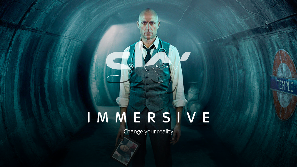
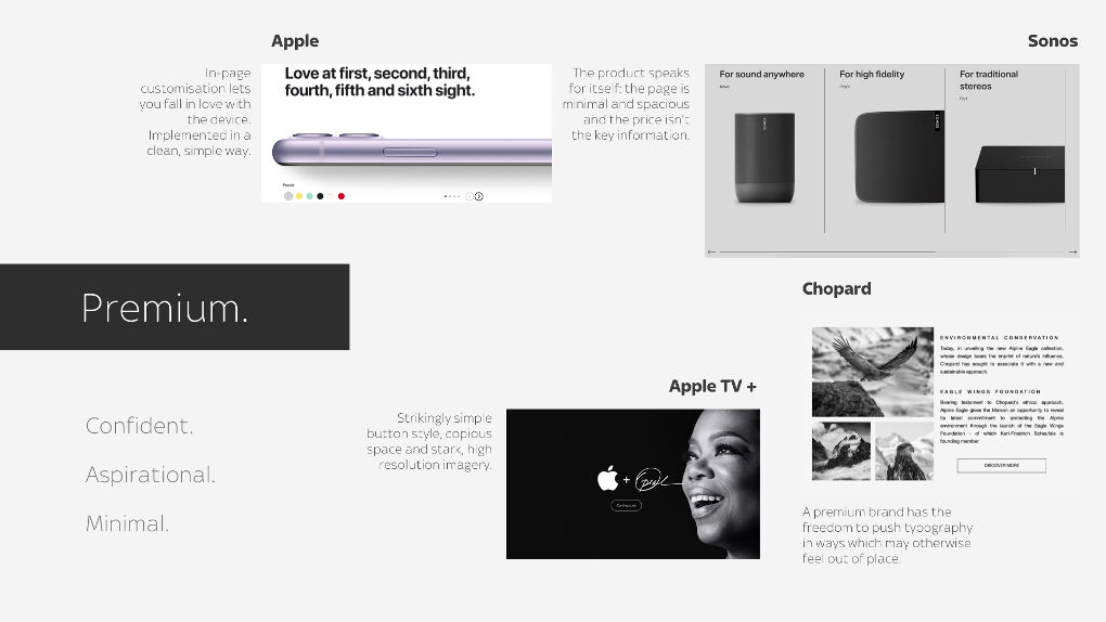
Exploring and reimagining Sky’s digital brand
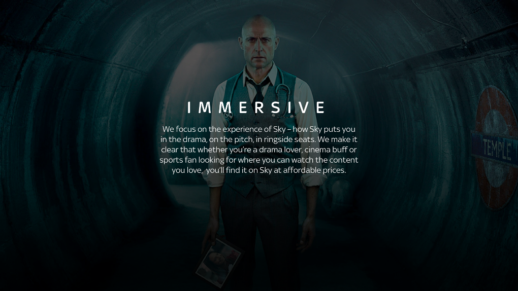
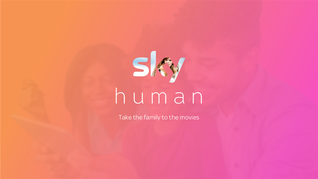
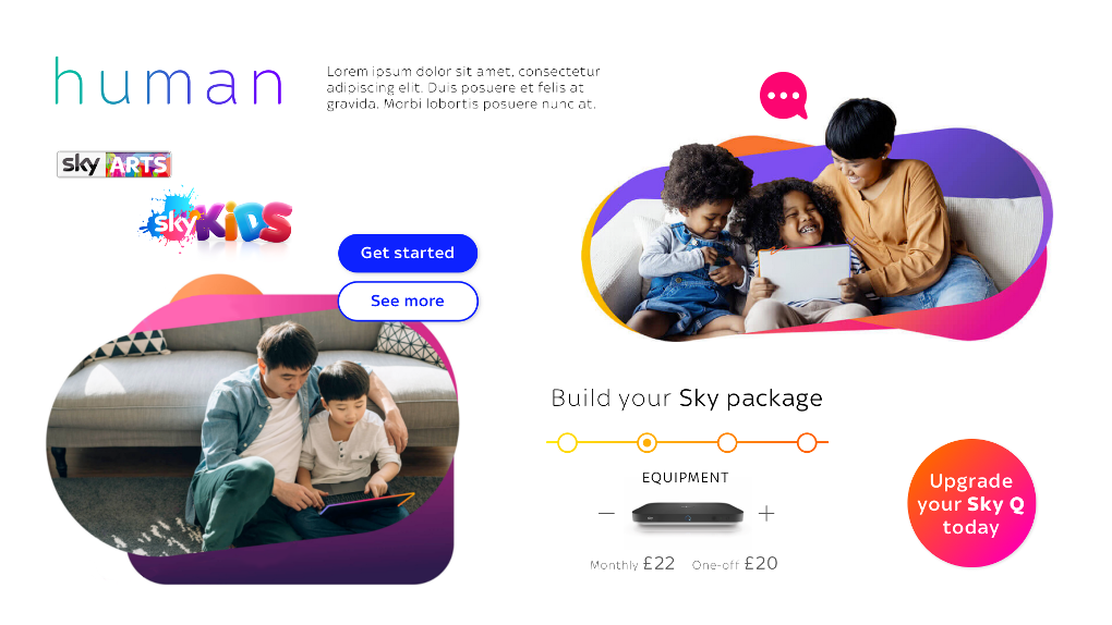
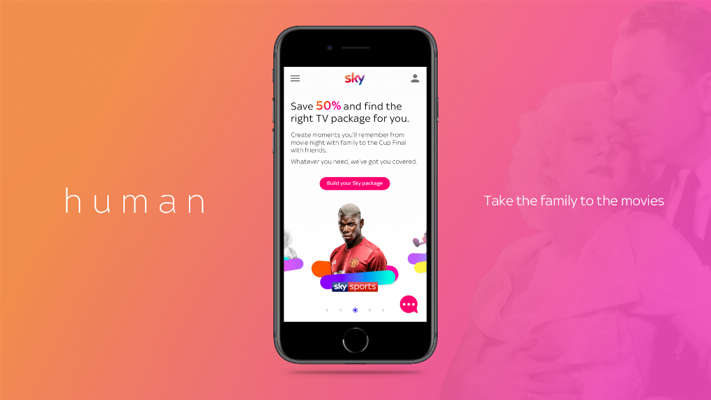
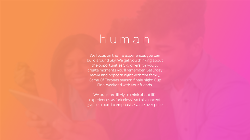
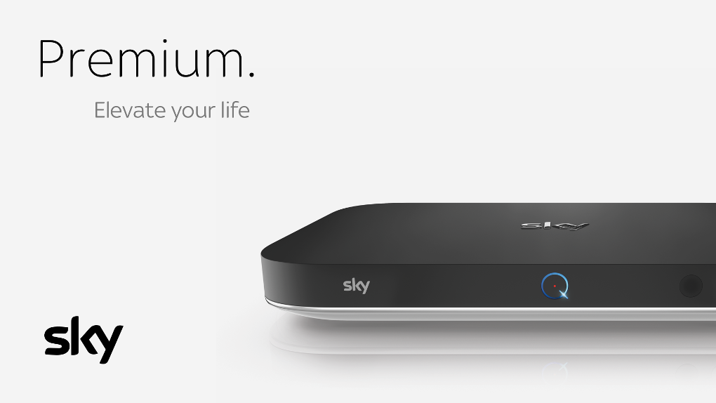
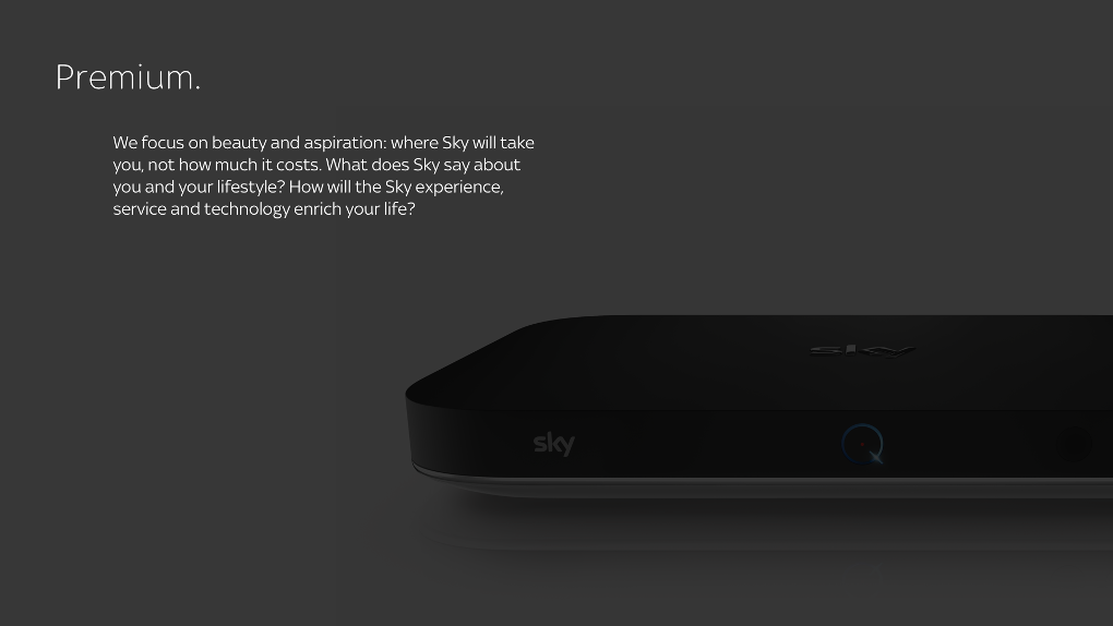
I defined 3 provocative directions to push the brand digitally to see what ‘felt’ like Sky. This exploration would then give us a jumping off point for our proof of concept work.
We presented each direction with an evocative description, sources of inspiration, a style tile, and UI mockups:


2
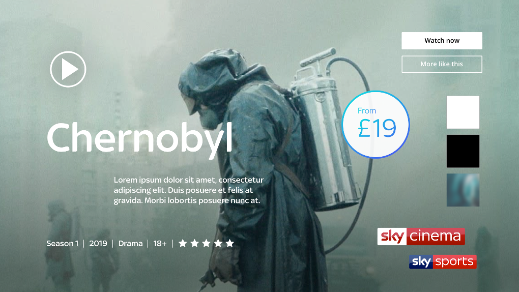
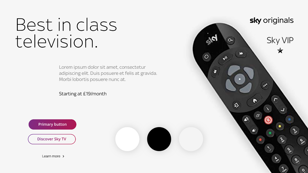
Proof of concept for a new Sky.com
With feedback from our exploration of brand direction, we were ready to start trying the new brand direction out on some of the sites key journeys.
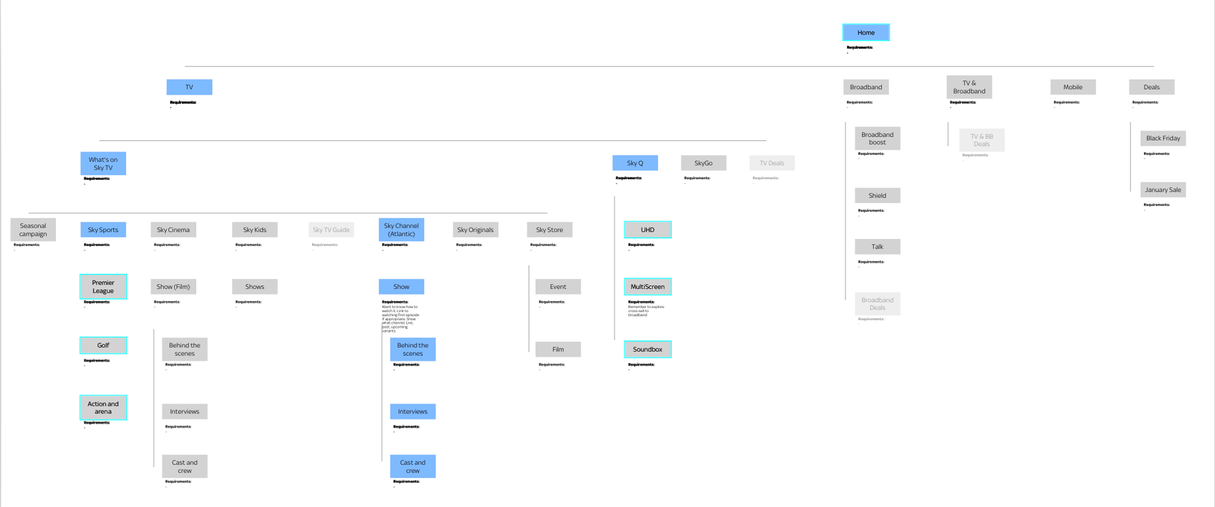
Based on user research insight, I defined an improved Information Architecture and begun wireframing key pages, with modularity and reuse of components front of mind. I worked alongside our UX writer to focus on the narrative of each page.
Getting the foundations right

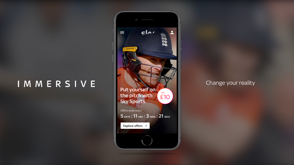
The most complex prototype ever
I knew motion and micro-interactions would be pivotal in making the experience as immersive as possible, so we developed principles for motion and spent time storyboarding animation and designing key moments of delight.
We relied heavily on the use of video to show off Sky's gorgeous content, and moments of delight particularly focused around the Sky Q hardware allowed us to explain the device's features in an inspiring way.
To sell our vision to stakeholders, I spent a huge amount of time in Protopie, building a high-quality, motion-forward prototype.

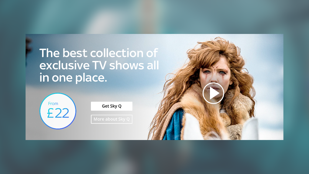
The proof of concept
3
Design and delivery of Brand New Sky.com
Our proof of concept was an incredibly valuable tool to prompt stakeholder engagement and excitement. We ran a roadshow of the prototype across many of Sky's product teams. The next step was to plan how to deliver this quality of experience across all pages on the Sky.com site.
We carried out an in-depth mapping exercise, capturing requirements from each product team, and pairing it with their own wish-lists and the findings from our previous user research, expert reviews, and landscape analysis.
A design system is born
We set the foundations for what would become a new Sky design system, including tokens, navigation and common components. We then worked page-by-page, each sprint gathering requirements from product teams, then designing and iterating based on stakeholder feedback.
I established a structure which would allow us to future-proof our design library, capturing design decisions for future designers - this was the beginning of an ongoing, multi-year engagement.
I also build a close relationship with the in-house development team ensuring a transparent atmosphere for critique.

Delivering the new Sky.com
Management of the digital brand was a constant negotiation and compromise. I worked hard to ensure that best UX practice was maintained, and that the built screens were as aligned with our approved and tested visual design direction as possible.
During my tenure on the project, we designed and supported in the build of all key sections of the Sky.com site - from TV, Broadband, and Mobile, to beginning work on the logged-in user area and the way in which deals are shown to users.